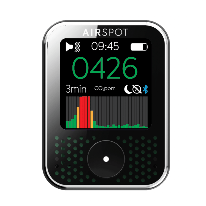

The new bar graph on the AirSpot device itself is fantastic.
It provides an extremely convenient way to quickly visualise recent trends in CO2 levels.
The last 30 measurements are provided.
The frequency of CO2 measurement on the device determines the time interval between each bar - for example if the CO2 measurement frequency is set to 1 minute the bar graph will provide updated bars on the right hand side of the graph every 1 minute.
The lower and upper limits of the bar graph can be set via the AirSpot app - at present this is accessed via the CO2 reading rate tab.
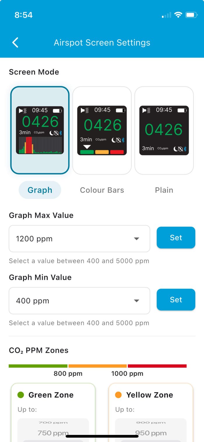
You’ll also notice there’s a couple of other settings here allowing for the screen to display the traditional colour blocks, or a plain version which displays just the current CO2ppm number on the device screen.
The on device graphs default to a baseline CO2 of 0ppm and an upper limit of 1600ppm.
You may want to change the limits to see the maximum variation around the what may be considered the actionable range of indoor CO2 levels - a baseline at 400ppm and upper limit at 1200ppm.
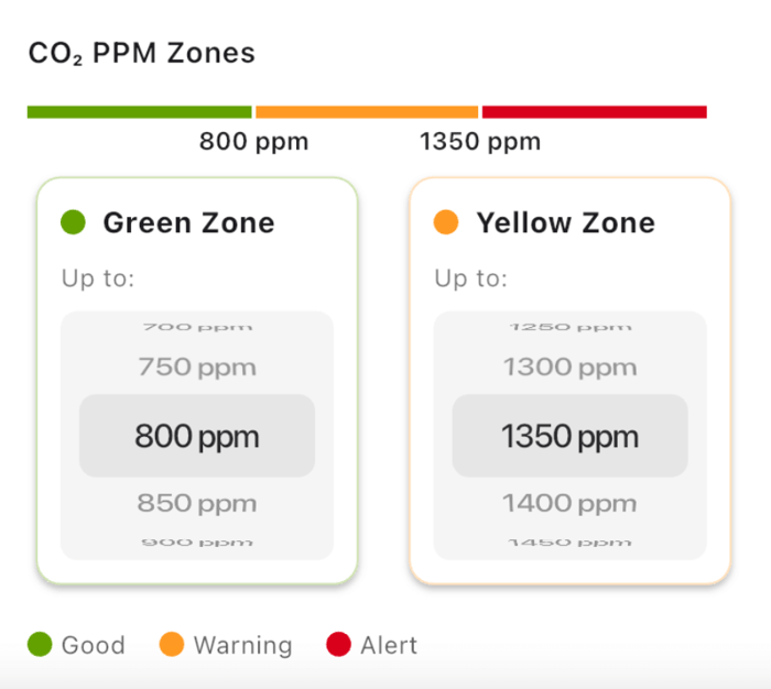
You'll also see that the limits of both the green zone and amber (yellow) zone on both the device and app graph can be adjusted from this screen.
Excellent work Peter and Narendra in bringing this device screen update to fruition - we love it.
If you have any suggestions for upgrades or changes to the device, device screen or app then please do get in touch via support@airspothealth.com - we’d be extremely grateful to hear from you.