Table of Contents
- Ventilation View
- Indoor CO2 Atlas
- CO2 data collection community on Discord.
- GitHub repository.
- Clean Air Map (Raven)
- CO2 Trackers
- COVIDCO2Map
- BreathSafe
- Visiblair Map & Information
- Boston Public Schools Indoor Air Quality
- An Individual (GNB)'s Mapping Data
- AirGradient
- OpenAQ
- World Health Network
- Safe Inside (UK)
- Clean Air Stars
- Clean Air Where
- COVID Action Map
- More:
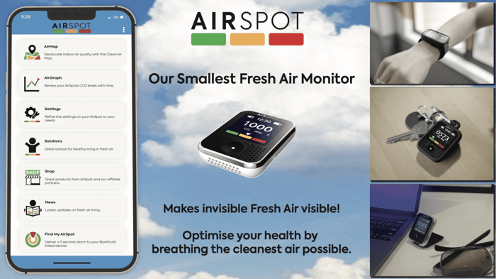
We’re extremely grateful that Raven has allowed us to link to their Clean Air Map through to the AirSpot App.
We spend more than 90% of our time indoors so there's great benefits in geolocating indoor air quality.
We envisage a future where air quality monitoring components within our smart phones can dynamically relay information onto a cloud based mapping system. There's a number of challenges in the way before we reach that point.
Below we discuss some of the air quality mapping systems we've come across. Please let us know if you're aware of any others.
A standardised categorisation of building type is also useful - this is what we've come across via Ai:
Elaboration:
- Residential: This includes homes, apartments, and other living spaces.
- Office: This category encompasses workplaces like office buildings, cubicles, and meeting rooms.
- Education: This includes schools, universities, libraries, and other learning environments.
- Healthcare: This covers hospitals, clinics, and other healthcare facilities.
- Commercial: This category includes retail stores, restaurants, shopping malls, and other commercial spaces.
- Industrial: This covers factories, manufacturing plants, and other industrial settings.
- Transportation: This includes vehicles like buses, trains, airplanes, and other means of transportation.
- Public Assembly: This includes spaces like theaters, stadiums, museums, and other venues where large groups of people gather.
Air quality will change over time with factors like building occupancy. There are already some indoor CO2 level mapping systems in place which provide dynamic data - perhaps most notably this Ventilation View App from Japan:
Ventilation View

The Ventilation View App only appears available on Google Play (not the App store).
During the pandemic several indoor CO2 mapping systems have been developed. If you’re aware of others then please let us know as we’d like to add to this list:
Indoor CO2 Atlas
Created by Aurel Wunsh - an open source system which can accessed via Git Hub and used as an application which currently functions on Android Phones:
CO2 data collection community on Discord.
Along with a
GitHub repository.
Clean Air Map (Raven)
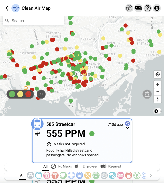
The Clean Air Map created by Kashif and Muzammil and the rest of the amazing team at Raven is a fantastic resource. Geolocated buildings displayed by colour indicate their CO2 level (green below 800ppm, yellow 80 to 1000 ppm and red above 1000ppm). Clicking on each dot brings up a whole lot of other data that users are encouraged to enter - the type of establishment eg hospital, restaurant, the masking requirements, air exchanges per hour, and further notes.
Locations can be filtered by type eg entertainment theatre. A search function allows the user to find a specific location by name within the geolocation field displayed. There's also a leader board of those entering data - to help encourage data entry and another leader board listing the locations by how good the air quality is. There's a link to simple explanatory videos on how to use the map and another link for a chat forum. Brilliant.
CO2 Trackers
The CO2 trackers system is similarly brilliant. It too has links to a great instructional video. The system also automatically assesses the percentage of rebreathed air based on the CO2 level provided - a great way for people to conceptualise what they're breathing.
COVIDCO2Map
Again another great resource. This map has also geolocated clean indoor air guidelines (CO2 limits) by location country. Great work.
BreathSafe
Visiblair Map & Information
Jeff Gilchrist has put together a huge amount of information and resources. He has provided a link to the Visiblair map which as well as indoor air includes the location of outdoor air sensors with particulate monitors.
Boston Public Schools Indoor Air Quality
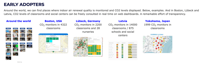
All our children should be gifted with a resource like this - ensuring the air they breath is constantly being assessed and where possible improved. Very well done Boston Public Schools - we can only hope the rest of the world catches on as quickly as possible.
An Individual (GNB)'s Mapping Data
An individual from Canada generated the data for schools in the New Brunswick area of Canada during 2020 and 2021. As well as CO2 levels they've calculated the % of rebreathed air the children are having to breathe within their classrooms and how many breaths (eg 1 in 19) are completely rebreathed air. Powerful stuff. Well done GNB.
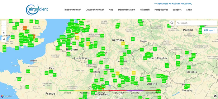
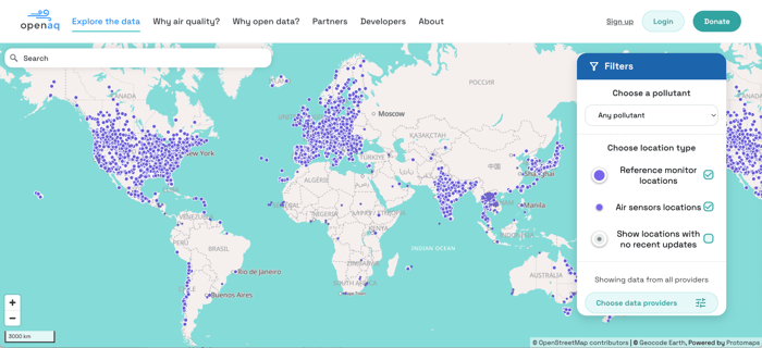
There are a number of groups who have created detailed maps which automatically synchronise data with a particular focus on outdoor air quality. Notably
AirGradient
OpenAQ
Directories
A number of directories with mapping data have also been developed - often businesses featuring their efforts to improve indoor air quality along with other features like respirator wearing, presence of HEPA filters etc.
World Health Network
The WHN community map serves as a global directory of COVID-conscious groups and teams.
Safe Inside (UK)
An excerpt from this wonderful site which lists businesses (mainly healthcare) by their type of business, on their map:
There is a large hidden market for healthcare services for people who are concerned about Covid infection. We are called every day by people saying they haven’t been to the dentist for years or telling us they switched to somewhere they found on Safe Inside. You have no idea this market exists because asking for mitigations in healthcare is too intimidating for most people.
The things people contacting us are asking for are not difficult, they are not expensive and they are not unreasonable. These are all things lots of dentists are doing for their customers;
- Be happy and welcoming if a customer asks would you please wear a FFP3 instead of a surgical mask, most customers will happily provide fresh masks. “We don’t have to anymore” might be true, but there is no downside and for the customer, huge upside. Do this for anyone present in the treatment room.
- If you can, open a window in the surgery to circulate fresh air
- If you have HEPA filters make sure they are running on full before the customer comes into the room
- Tell the customer they can get the first appointment of the day or tell them when quieter times are
- Let the customer wait outside and offer to give them a call when it is time to come in
- If possible offer them a separate entrance so they can go straight to the treatment room
- Have a sign somewhere telling people you are happy to be asked about masking
- Have a similar message on your website – you already have lots of messages saying you are really understanding of anxious patients
Clean Air Stars
From the Clean Air Stars web page:
This website has been developed to help businesses understand how to assess their indoor aerosol transmission risk, find professional guidance where time and resources allow, get advice and testimonials from businesses that have already taken action to protect their customers, and build a directory of businesses like restaurants, bars, cafes, and gyms for customers to find a business with safer air.
Clean Air Where
The Clean Air Where app based map is on it's way too. It too will provide a directory of businesses highlighting their steps to improve air quality.
COVID Action Map
More:
The people and teams behind these maps are doing an amazing job. They're passionate and completely dedicated to providing a better environment for all of us.
What similar mapping systems have you come across?
It would be great to amalgamate all of this data and provide a resource that is extremely easy to interact with. A resource that offers the benefits of both a map and a directory combined. That provides dynamic data on air quality and an accepted, standardised set of parameters for public indoor spaces to aspire to. Perhaps something which utilises a system similar to Google reviews.
We look forward to the day clean air is a given.
In the meantime keep clean air safe and get in touch with your thoughts, insights and ideas.
What does the ideal clean air map look like to you?
